
Alison
Career Ready Plan
Led 4 designers through a two-phase redesign for a 50M-learner platform: student onboarding against a 23.4% completion rate, then a 0-to-1 educator dashboard.
Jump to deliverable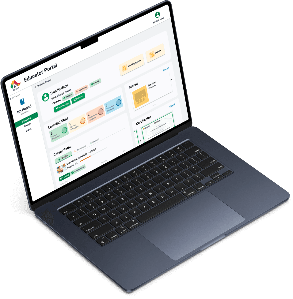
Prologue · Education for All
So many students, so little time…
Mr. Jones is a career guidance counselor managing 150 students with diverse career paths. In many developing regions, access to career guidance is limited which is where Alison, an online education platform, saw an opportunity to bridge this gap by bringing its Career Ready Plan into classrooms.

So, What’s the Problem?
Teachers lacked visibility into students’ career learning progress. With guidance from Alison, I led and mentored a team of 4 designers in creating an administrator interface that helps educators guide, monitor, and support career exploration at scale.
Design Question
How might we further develop Alison’s Career Ready Plan to make a wider and more lasting impact on job-seeking students from different backgrounds?
Act 01 · Research
User Research
I led user research in the form of competitor analysis, web audits, user interviews, and 15 usability tests across 4 product areas. As a result, my team developed Mr. Jones as a persona to ground our decisions in a realistic educator use case.
Methods
- 01Competitor analysis
- 02Web audits
- 03User interviews
- 04Usability tests

Persona
Mr. Jones
“The Empathetic Educator”
Mr. Jones wants a tool to streamline the process of drawing information from students without the tech jargon that complicates simple tasks.
Goals:
- Keep tabs on his whole class’s career interests
- Communicate to students about tasks and reminders
Pain Points:
- Difficult to digest cluttered rosters
- Weak knowledge of common web functionality
Pain Points
We clustered 30+ observations into 3 key barriers:
Overwhelming Tech Jargon
Varying tech proficiencies made essential tools difficult to find.
Unappealing Visual Design
Outdated UI reduced clarity and usability.
Lack of Connection to Students
Weak communication tools limited meaningful teacher–student interaction.
At the end of the day,
Mr. Jones doesn’t want to manage software.
He wants a fast, intuitive way to track student progress and interests. We prioritized streamlined information and clearer communication to support this goal.
Act 02 · Ideation
Narrowing Down The Scope
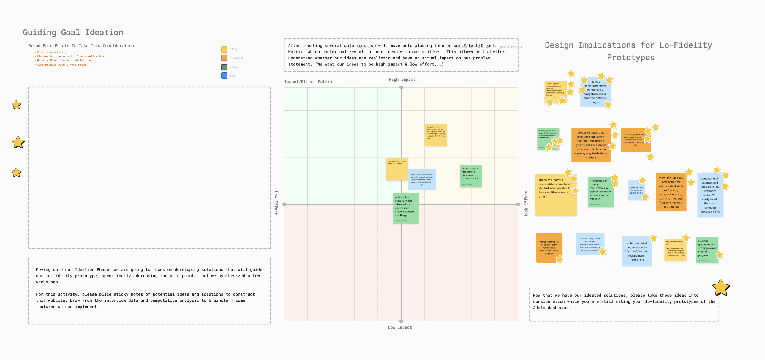
With the goal of direct, streamlined functionality in mind, the team went back and ideated solutions grounded in these insights and the educator’s perspective at the helm of our decision-making.
Design Solutions
Putting together our design implications, we defined 4 core features that balanced usability, functionality, and visual clarity, then refined them across 3 rounds of lo-fi wireframes.
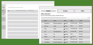
Student Roster
Users can view a class roster that clearly displays each student’s name, Career Ready Plan progress, career goals, and group.
Features
- 1Comprehensive spreadsheet of students
- 2Key labels (grade, goal, career path)
- 3Filter, search, and add students
Design Implications
- Simple, organized layout
- Modern UI design with clean graphics
- Easily identifiable action items
User Flow Chart
We mapped the web structure through user flow diagrams to clarify navigation and interactions.
Act 03 · Final Prototype
Alison Career Ready Plan
Educator Dashboard
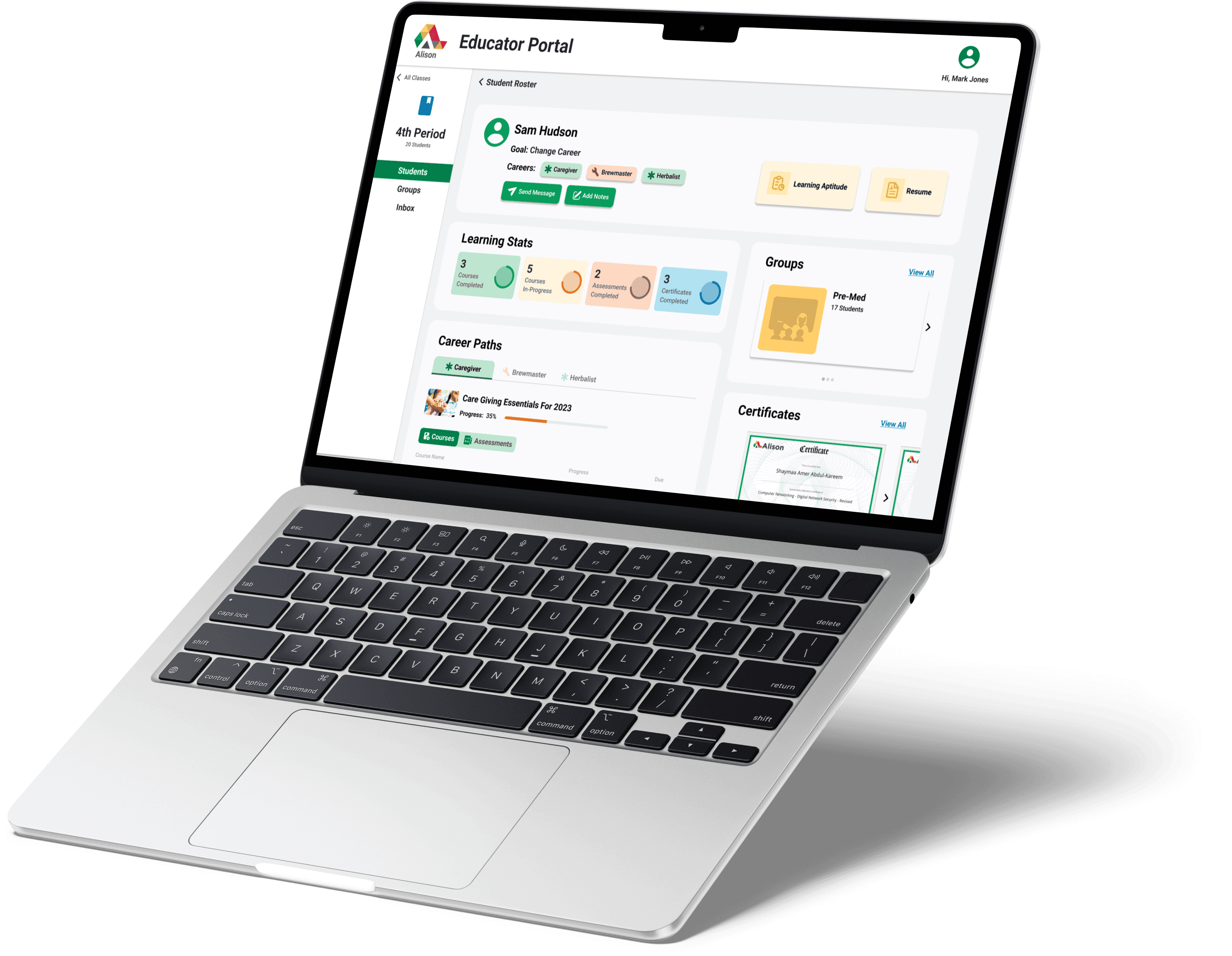
An accessible learning management system designed to bring educators closer to their students as they embark on their career journeys. All 4 features run on a shared design system and component library I built.
Feature 01
Student Roster
A simplified class roster for educators to manage each student’s Career Ready Plan.
- Minimal Text Clutter
- Distinct Colors
- Quick Access to Student
Feature 02
Student Profile
A comprehensive summary of each student’s progress with access to interactive documents.
- Singular Page Structure
- Career Course Progress
- Interactive Tabs and Pop-Ups
Feature 03
Groups
Roster and Discussion features for smaller groups of students with similar career interests.
- Career Community Hub
- Streamlined Organization
- Discussion Forum
Feature 04
Inbox
An intuitive, easy-to-access communication line between educators and their students.
- Simple, Intuitive Online Chat
- Discussion Filter

Epilogue · Reflections
Takeaways
This project reinforced the importance of intentional hierarchy and clarity in design:
Takeaway 01
Broaden the Use Case
Designed for varying tech familiarity by simplifying navigation without sacrificing functionality.
Takeaway 02
Iterate, Iterate!
3 rounds of lo-fi wireframes and 15 usability tests helped refine page structure and improve usability through clear visual hierarchy.
Takeaway 03
Ideas Flourish in Conversation
Ongoing reflection and team discussion strengthened decision-making throughout the process.
Room for Improvement
Due to scope constraints, some features — including the discussion forum and profile notes — remain opportunities for future expansion.
With that being said, Mr. Jones should have a much easier time managing his class’s career pursuits!