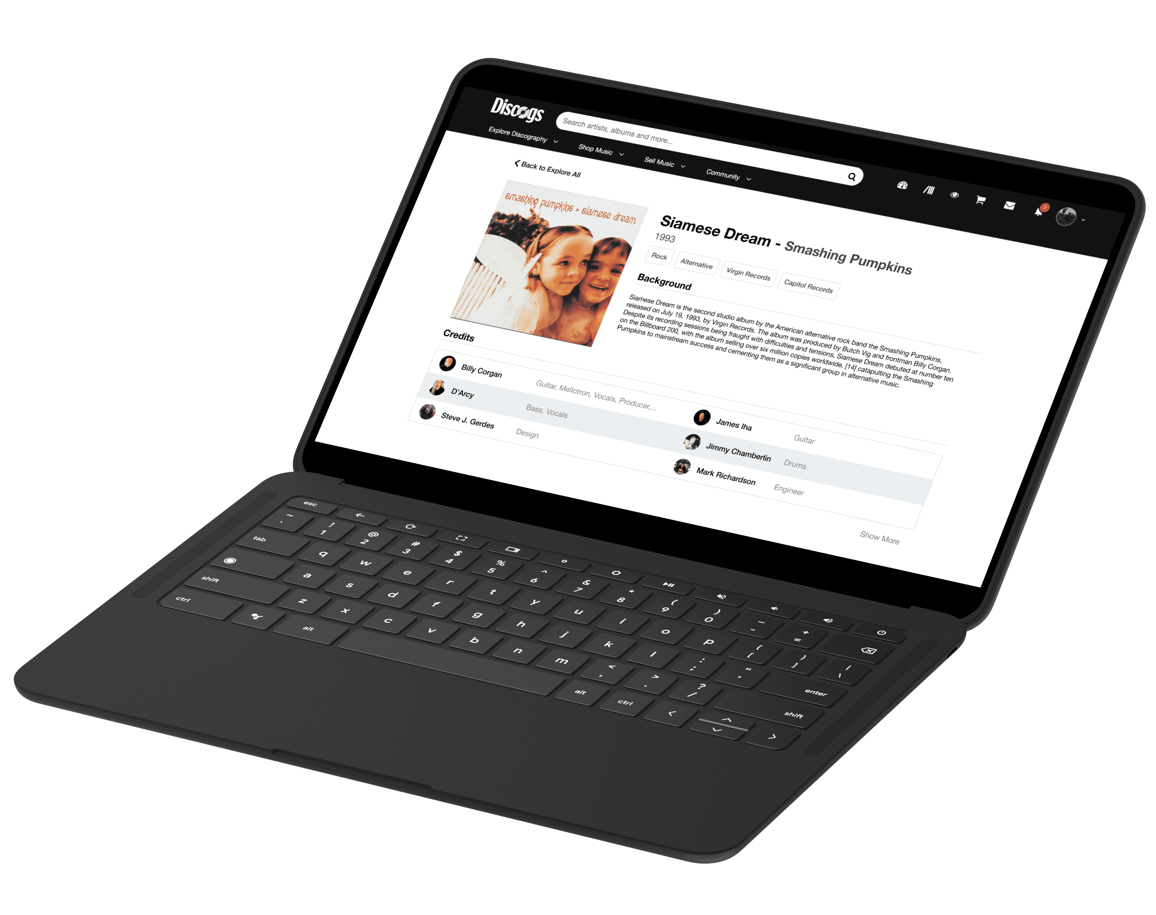
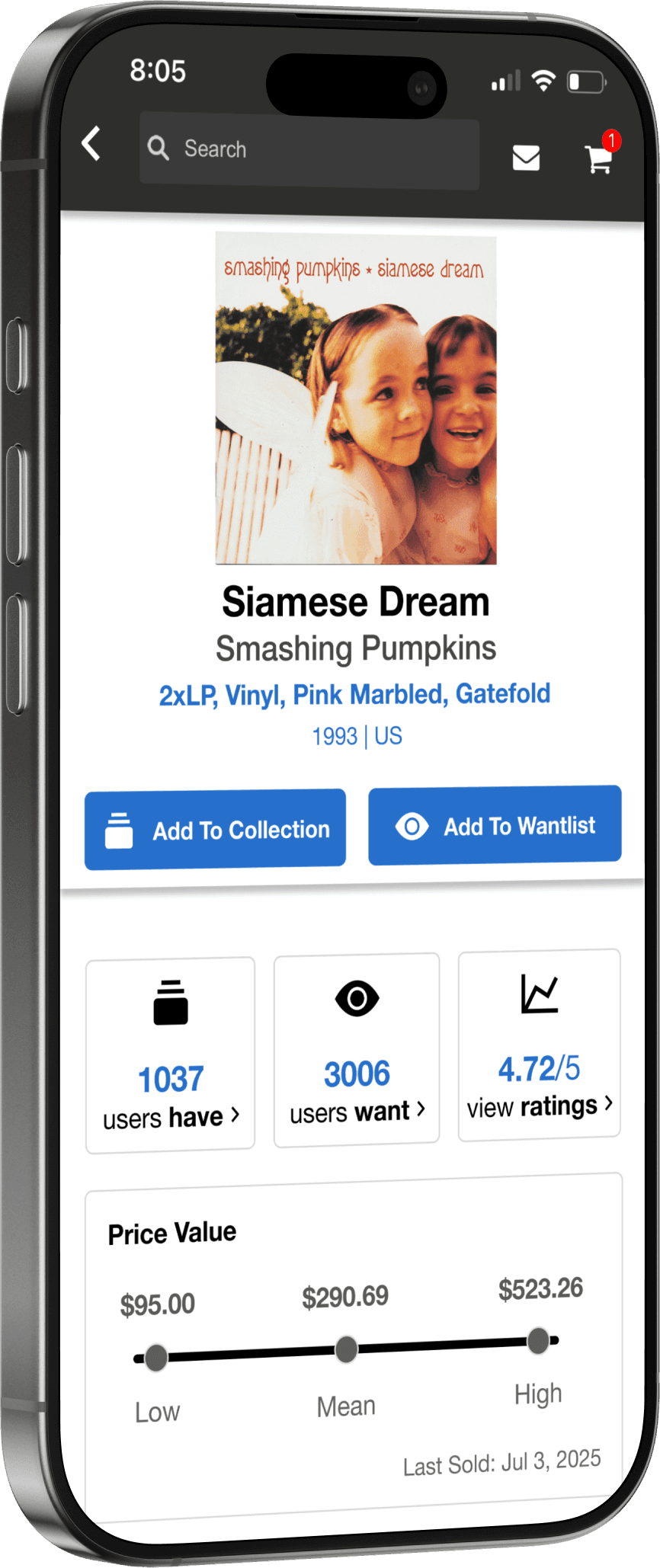
I love music. A loooooot.

Design Question
When I stepped back and listened to users through user interviews, 3 clear struggles kept coming up.
01
Confusing Page Hierarchy
Unclear information structure
Ambiguous page transitions and redirects
“I’m not sure what this page is supposed to represent”

- Gian Diloy (User Interviewee)
02
Choice Overload
Too many buttons and filters competing for attention
Uncertainty about where actions would lead
“There’s way too much on the screen”

- Joshua Lee (User Interviewee)
03
Dated UI
Limited visual hierarchy and contrast
Difficulty identifying what mattered most on the page
“It feels like early 2000s eBay; definitely hard to read”

- Min Lee (User Interviewee)
Bringing together research insights, I defined the core use case.

Billy Corgan
“A tech-savvy, enthusiastic Gen-Z music nerd”
Billy uses Discogs to find the next vinyl LP for his budding record collection.
Goals:
Discover new artists and albums
Learn about physical music formats
Build a personal vinyl collection
Pain Points:
Gets lost navigating the site
Struggles with technical terminology
Has difficulty distinguishing between media types
At the end of the day,
From my research findings, I came to 3 design goals that prioritized usability for general users.
Simple Navigation
Reduce click depth by consolidating information into fewer, more intentional pages.
To address the confusion around navigation, I mapped Discogs’ existing architecture and identified opportunities to condense and linearize the experience. This allowed me to reorganize features into a clearer progression.
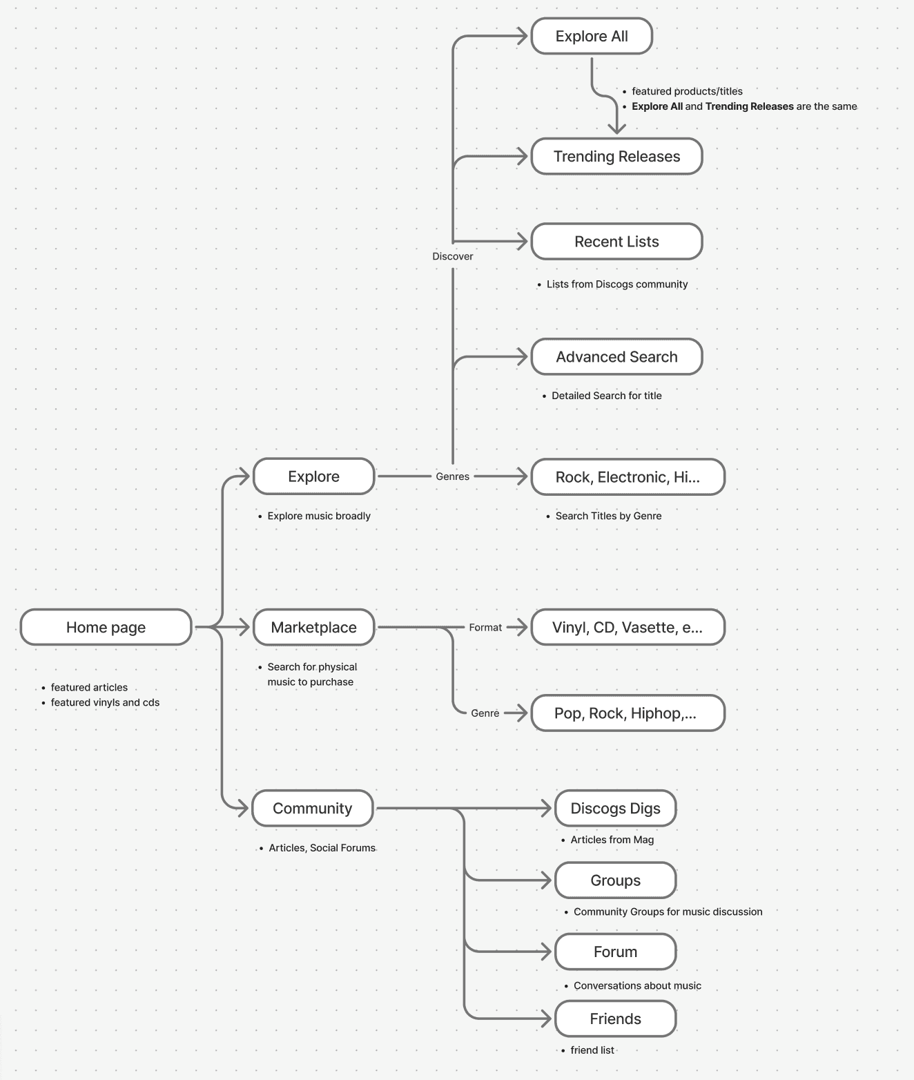
User Flow Map
Equipped with a strong grasp of Discogs’ current structure and a use case that I wanted to tackle, I selected and focused on 3 crucial pages that could be streamlined and redesigned.
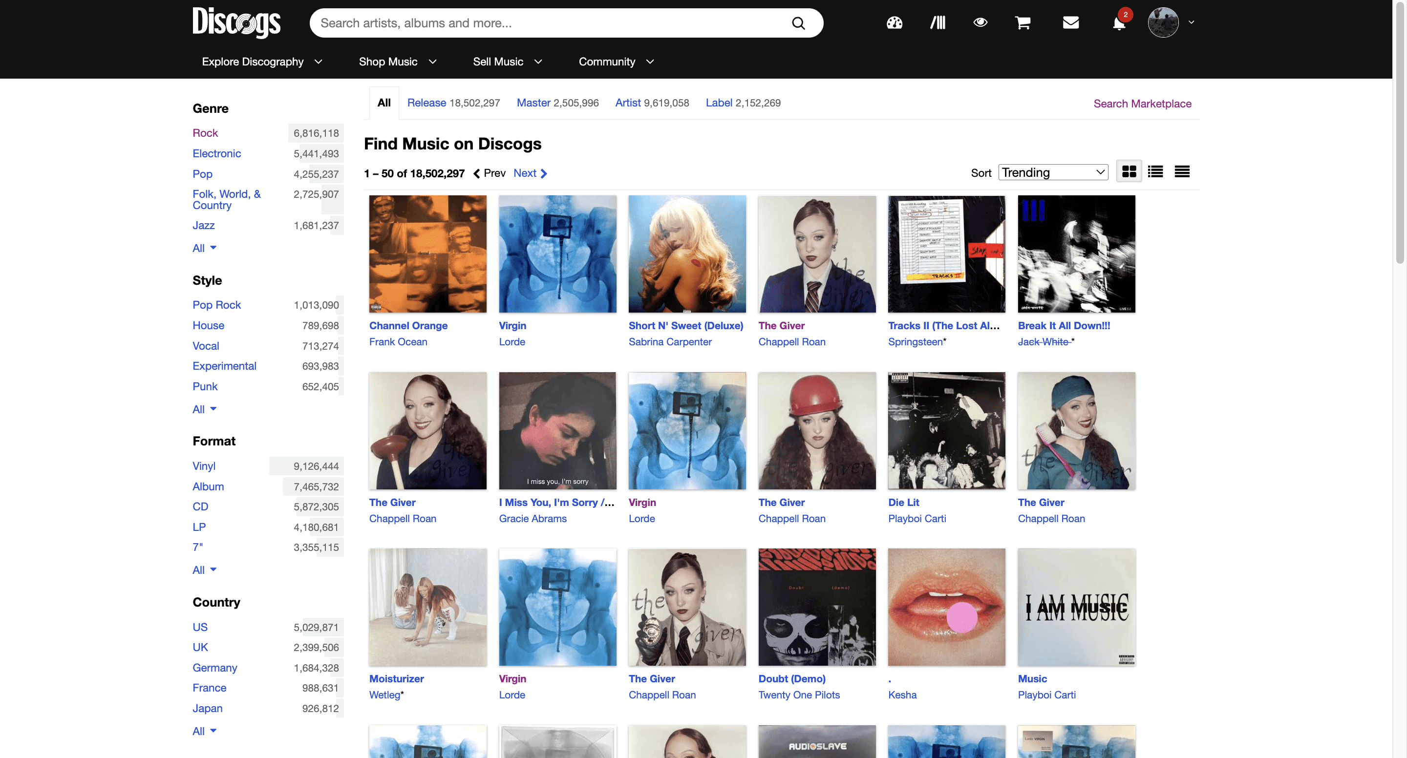
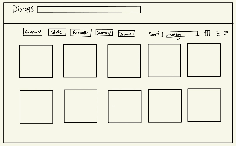
The “Master Release vs Product” Problem

“It’s hard to tell if this page represents the album as a piece of music or as its vinyl copy!”
A major source of confusion stemmed from Discogs’ distinction between an album as a musical work and an album as a physical object. I realized the issue wasn’t visual clutter but conceptual ambiguity. The differences between these pages were too subtle, causing users to lose their sense of place.
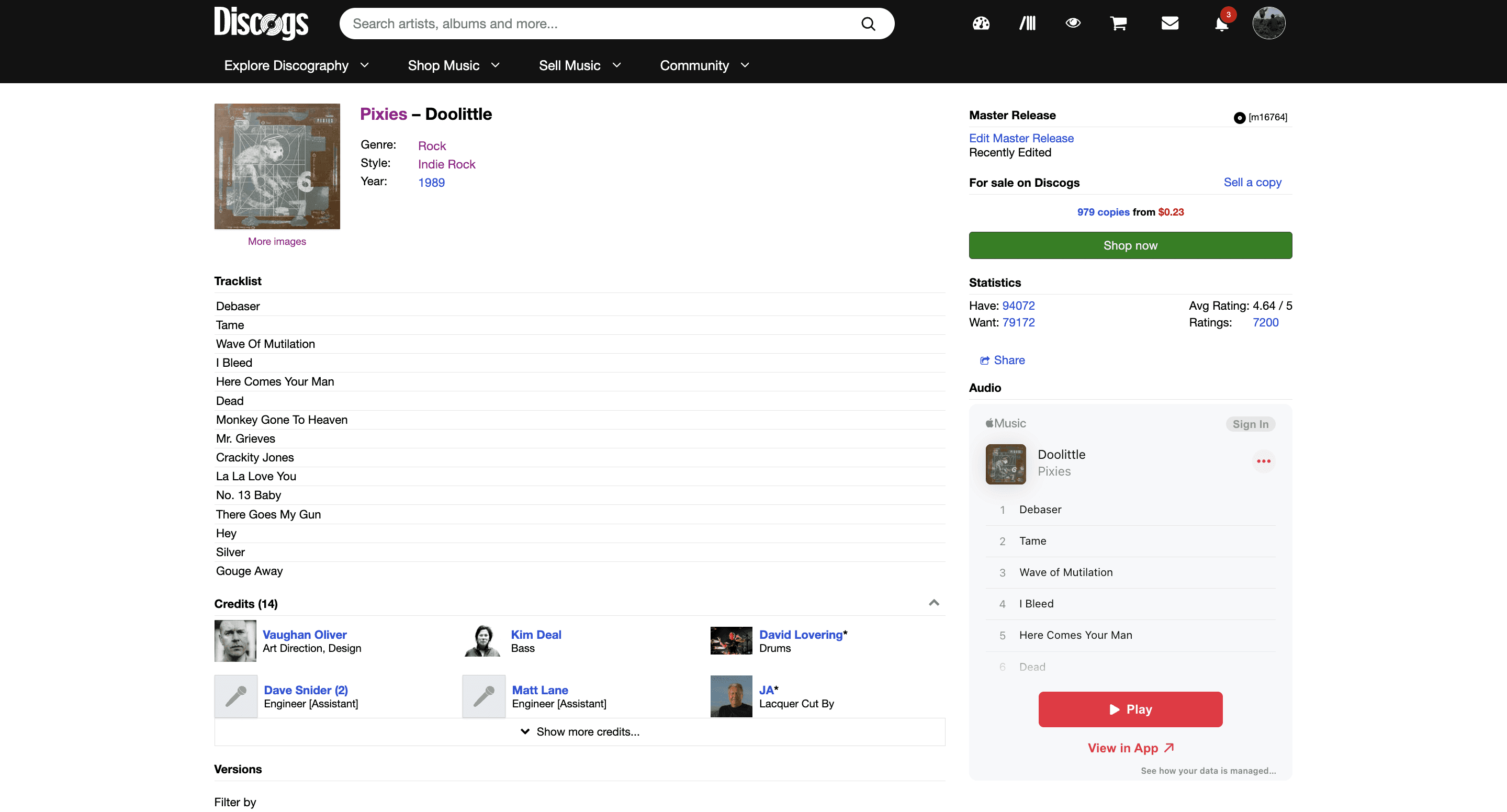
Master Release Page
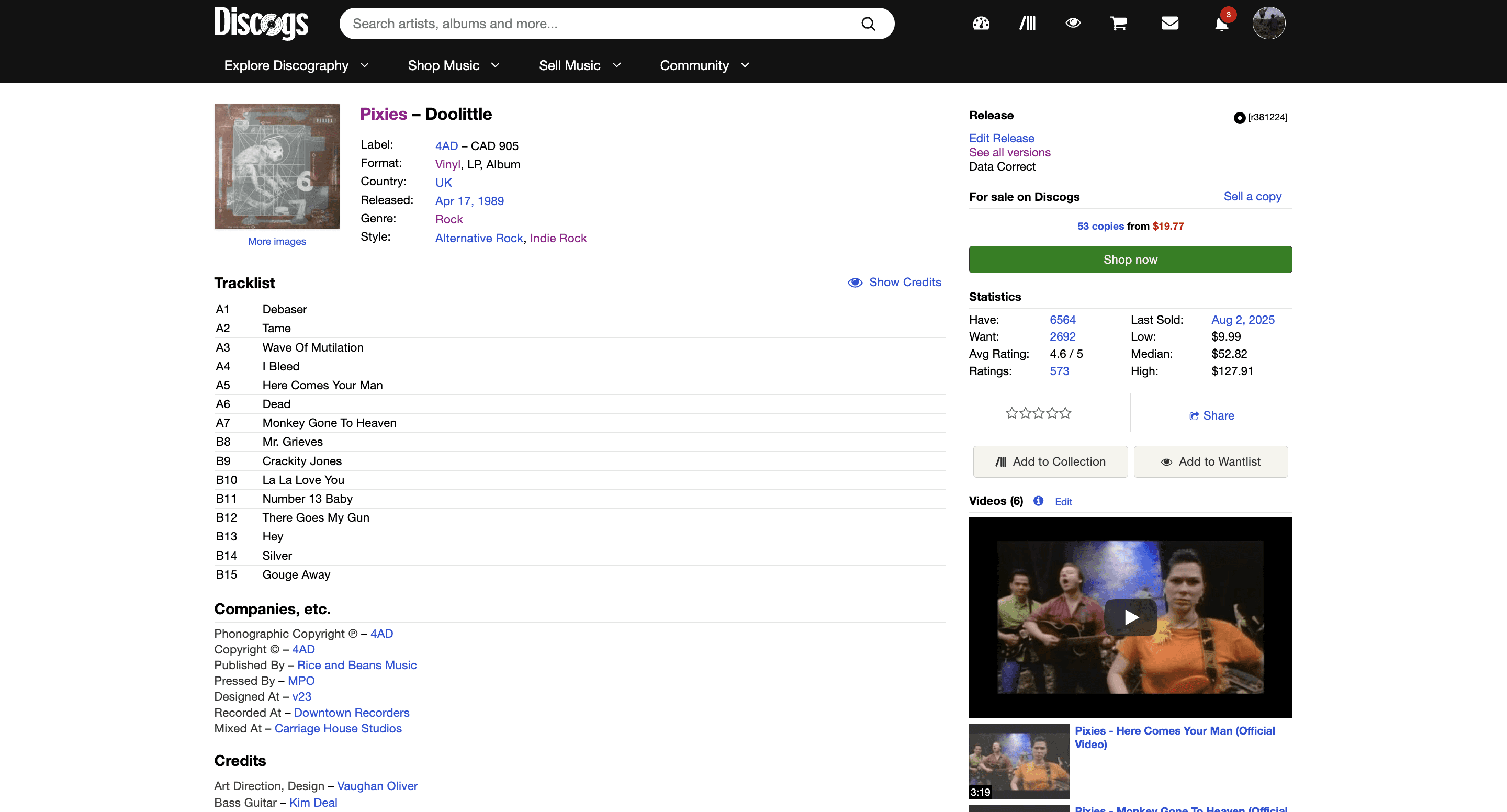
Product Release Page
To address this ambiguity, I took on a top-down approach to reorganizing how users navigate Discogs’ expansive collection of music, streamlining the user experience into a linear path.
Explore
Master
Product



This project reinforced the importance of intentional hierarchy. Here are some lessons I learned along the way:
Takeaway #1
Iteration is KEY
Each revisit opens up new problems to address, which only strengthens the final design.
Takeaway #2
Consistency is Priority
Having a unified language throughout the entire site assures an enjoyable and digestible experience.
Takeaway #3
Less is More
Subtle changes between texts, colors, and spacing were enough to communicate info hierarchy.
I would spend more time expanding interaction around Discogs’ existing Collection feature and conducting deeper research into what information collectors value most when evaluating physical records.
With a clearer path between curiosity and ownership, Billy can spend less time navigating and more time building the collection he loves.